A modern date picker for Solidres — one search bar, the way guests expect it
We’ve replaced the ageing jQuery UI date picker with a fast, dependency-free, OTA-style range picker — the same single-tap check-in → check-out flow your guests already know from the major travel-booking sites.
For years, every date field in Solidres — the booking funnel, the search modules, the admin reservation screens — was powered by the jQuery UI date picker. It did the job, but it was showing its age: two separate calendars for check-in and check-out, a heavy pile of JavaScript, no dark mode, and accessibility gaps that never sat well with modern web standards.
So we rebuilt it. Meet the modern date picker — and the unified search bar it now lives in. Available in Solidres v4.2.0.
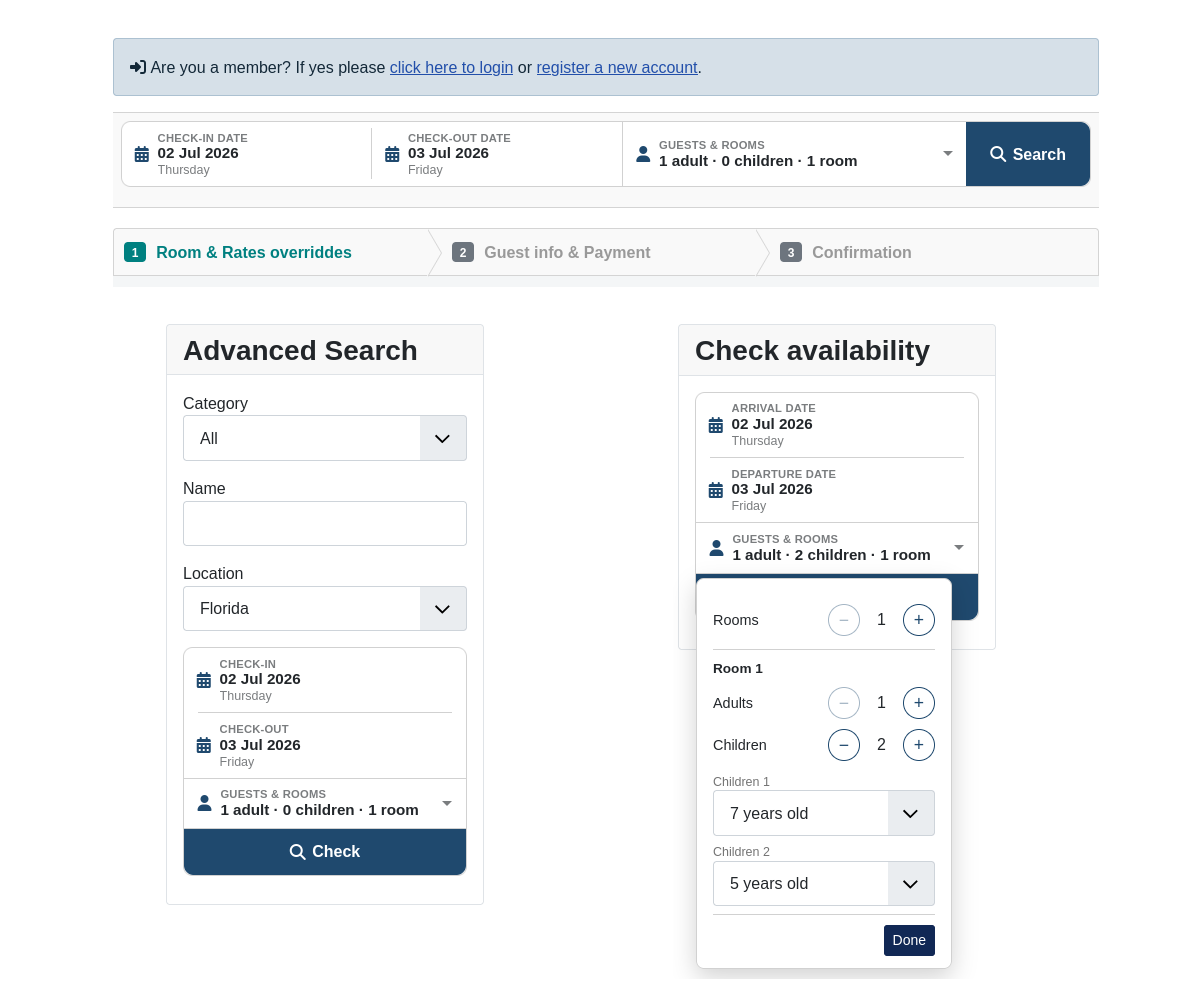
One picker, not two
The biggest change is the one your guests will feel first. Instead of two disconnected calendars, there’s now a single range picker: tap your check-in date, and the valid check-out window lights up instantly — respecting availability, minimum and maximum stay length, and any booking rules you’ve set. Tap check-out, and you’re done. Two months show on desktop, one on mobile.
Crucially, the calendar is availability-aware: a guest can never select a range that spans a night you’re already booked or have blocked. Fewer dead-end bookings, fewer support emails.
Lighter, faster, no jQuery
The old picker pulled in jQuery, jQuery UI, a base theme, and 68 separate locale files — well over half a megabyte before a guest could pick a date. The new picker is a single zero-dependency library of around 15 KB gzipped. That’s a meaningful cut to what every visitor downloads, and one less legacy dependency to maintain.
Accessible and dark-mode ready
The new calendar was built to today’s standards, not 2012’s:
- Full keyboard control — arrow keys to move, Enter to select, Esc to close, with a visible focus ring throughout.
- Screen-reader friendly — the month, focused day, disabled dates, and selected range are all announced properly (WCAG 2.1 AA).
- Automatic dark mode — it follows the visitor’s system preference and your template’s theme, with no hard-coded colours to clash.
A search bar that finally feels like one
We didn’t stop at the calendar. The sprawling room / adult / child drop-downs have been folded into a single guests & rooms popover with friendly plus/minus steppers — one per room — summarised in plain language (“2 adults · 2 children · 1 room”). Paired with the slimmed date field, every search surface now reads as one cohesive [ Dates ] [ Guests & rooms ] [ Search ] bar — the pattern travellers recognise from every major booking site — that folds gracefully into a stacked card on narrow screens and in sidebars.
Nothing to configure — and a safety net if you need it
The modern picker is the default for every site, new and upgraded alike — there’s nothing to switch on. Your existing booking rules, availability logic, and submitted data are all untouched; this is a front-of-house upgrade, not a change to how bookings work.
Run a heavily customised template? A new “Datepicker engine” option in Solidres Configuration lets you flip back to the Legacy picker in a single click. We’re keeping that option around for several releases, so there’s a long, safe window to update any custom overrides at your own pace.
Modern by default, legacy on tap, and a booking experience that finally matches today’s leading travel sites — that’s the new Solidres date picker. Upgrade, and your guests get it automatically.